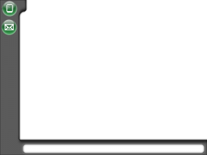
Just finished laying out the Starport interface. I think it looks good for an amateur, after about 20 failures in a row trying to get it to look right.
Click to embiggenate.
I just noticed, after uploading of course, that the mail icon isn’t exactly centered beneath the datapad icon. That’s easily fixed though. Hooray for saving everything in layers!
The white area at the bottom is a kind of HUD that displays some ongoing, important information, such as your bank account, cargo bay usage, and the current date. The original game’s usage of ship time as absolute time is now a regular date/time system. Which makes it more easily readable by people than trying to convert 0.15 days into 3 hours, 36 minutes.
Onward and upward…
One thought on “Star Merchant 2 – Starport Interface”
Comments are closed.


Enbiggening even the smallest of us.