Yes, there is a story behind the cover art for Horror Screenwriting. Originally I had conceived of something more along the lines of a comic book depiction of Death driving a souped-up hot rod, cigarette in hand hanging out of the driver’s side window.
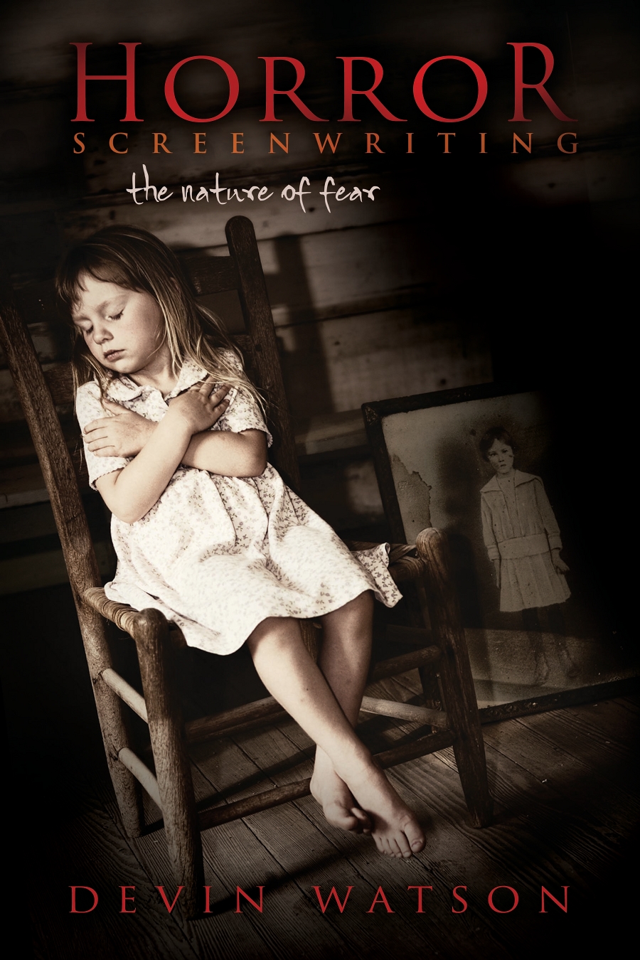
For reference, here’s the final cover art for the book. Click to enlarge:
Then I had a nightmare. When you go to sleep at night, your brain tends to purge everything in the subconscious up to you while asleep. So it was for this particular night. It was an “out of time” nightmare. I was stuck in the past, in the Victorian Era, as a post mortem photographer.
Now for a history lesson. Contrary to present time, it was common practice then to photograph recently-deceased loved ones, often posed with their living relatives. Babies and children were not exempt from this practice either, due to the fact that the mortality rate for children back then was very high compared to modern day.
This would often be the only memoriam people would have of their children or relatives. Daguerreotypes and later plate photography would make this process less expensive and also provide for copies so that other relatives scattered about the world could see for themselves. Imagine getting that on a Christmas card!
It was not considered morbid or gruesome to do this. Rather, it was a way to memorialize somebody for loved ones. Today it would be considered taboo in most countries, although there are a few that still practice it. Law enforcement used it not only for crime scene documentation, but also to inform the public that a criminal had been killed, such as John Dillinger.
I should note that the cover art for Horror Screenwriting is most certainly not a post-mortem photograph. It was a staged photograph that is reminiscent of a practice of a bygone era which only shows how we have insulated ourselves away from death, when, only a century or so prior people dealt with it on a daily basis right in front of them.
